
Published 2026-08-05 · By MarkupGen Team
Figma to React: A Practical Workflow for Developers
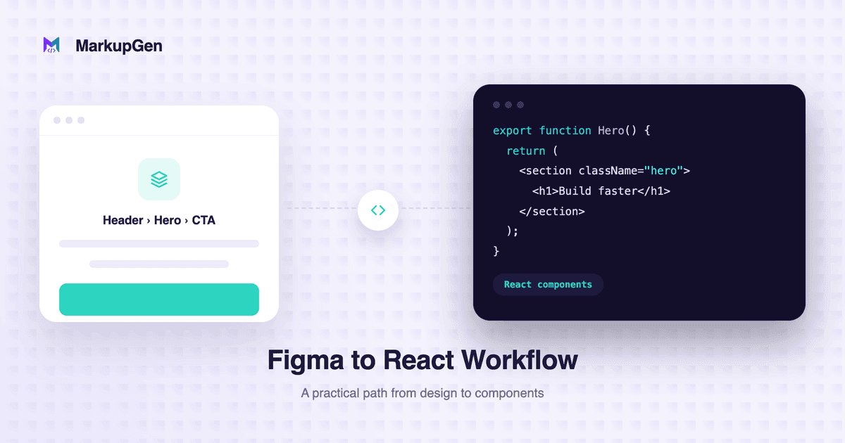
Turning a finished Figma design into working React components is one of those tasks that looks simple in the design file and gets tedious the moment you open an editor. You're not just writing components — you're re-deriving spacing, alignment and responsive behavior that already exist in the design, then hoping the result still matches after a dozen small judgment calls. Here's a practical Figma to React workflow that keeps that judgment focused on the parts that actually need it: component boundaries, layout behavior, and how the result holds up across screen sizes.
Why hand-building React components from Figma is slow
Most of the time developers spend on this hand-off isn't spent solving hard problems — it's spent translating already-finished decisions into a different format:
- Reading each layer's Auto Layout settings and re-implementing them as Flexbox rules inside JSX.
- Re-measuring padding, gaps and font sizes that are already defined precisely in the Figma file.
- Guessing where a component should become responsive, since a Figma frame is usually just one fixed width.
- Structuring components and props from scratch instead of starting from something usable.
None of this requires design skill or particularly hard engineering — it's repetitive, mechanical work, and repetitive manual work is exactly where mismatches between the design and the shipped UI creep in.
From Figma components to React components
There's no single rule for turning a Figma layer into a React component — it depends on how much of it repeats, what its variants represent, and how the rest of the app is structured. As a starting point, a Figma component with variants (a Button with primary/secondary states, for example) usually becomes one React component with those variants handled as props, not a separate component per state:
<Button variant="primary" size="md">
  Get started
</Button>
The same logic applies to anything that repeats in the design — three similar cards in the Figma file are a signal for one Card component rendered from an array of data, not three copies of the same JSX. The most common way this goes wrong is over-componentizing: turning every Auto Layout frame into its own file adds indirection without adding reuse. For the fuller Figma-to-React concept mapping — including where component boundaries and variant props typically go wrong — see Figma Auto Layout to React: From Frames to Components.
The MarkupGen workflow, applied to React
MarkupGen is a SaaS platform with a companion Figma plugin that converts a Figma design into HTML, CSS or React components, so you can start from generated code instead of a blank component file. The workflow has four steps:
1. Export the frame from Figma. Select the frame you want to convert and send it to your workspace with the MarkupGen Figma plugin. It captures the frame's structure, styles and images together, rather than making you copy them layer by layer.
2. AI builds the code from the actual design. From there, AI builds out HTML and CSS based on the real structure and styling of the frame — not a generic guess at what the design "probably" looks like.
3. Choose React as your output format. Output format is a choice you make per export: Vanilla HTML/CSS, Tailwind CSS, or React components. Pick React and you get components built from that same structure, ready to sit inside an existing codebase instead of a static page. (Need HTML/CSS instead? The general Figma-to-HTML workflow covers that path.)
4. Refine, then export the final package. Before generating the final code, an in-app editor lets you adjust content, fonts and layout visually. Each export also gets an automatic AI quality score, so you know at a glance whether it's close enough to production-ready or needs another pass.
How Auto Layout becomes Flexbox inside your components
The part of this that saves the most manual work is layout. Figma's Auto Layout properties — direction, gap, padding and alignment — are automatically mapped to an equivalent CSS Flexbox structure, and that mapping carries through into the generated React components, not just a static HTML page. A row of Auto Layout items with a defined gap becomes a flex container with the matching gap, padding and alignment already wired into the component's styles, instead of a component you have to eyeball into place. Nested Auto Layout frames map to nested flex containers the same way, which covers most card, list and navigation layouts — a handful of genuinely grid-shaped designs are still a better fit for CSS Grid. If you want a closer look at exactly how that mapping works, see how Auto Layout maps to Flexbox.
Making the responsive behavior hold up
Responsive behavior is where Figma-to-React output deserves the closest look, not the least. Auto Layout's sizing modes — Hug, Fill, Fixed — and a frame's resizing constraints are real signals about how a component should behave at different widths: a Fill container is a signal for a flexible width or flex: 1 in CSS, not a fixed pixel value. But neither Figma nor a conversion tool can fully generate complete responsive React code on its own — specific breakpoints, how a layout should reflow on mobile, and whether a component needs a different arrangement below a certain width are decisions that still need a person to interpret, informed by those signals rather than replaced by them. In practice, that means checking generated (or hand-built) components at a few real breakpoints instead of trusting that a max-width or media query carried over correctly, and treating a desktop-only Figma frame as a starting point for mobile behavior, not the final word on it.
Reviewing components before you drop them into your app
Generated code gets you most of the way there, but it's still worth a review pass before merging it into an existing app:
- Check the component boundaries. Confirm the generated components split where you'd naturally split them in your own codebase — you can always split further once they're in your project. Buttons, cards, nav and other repeated UI are usually the right size for a component; splitting all the way down to every layer just adds indirection.
- Look at the markup, not just the visuals. Output favors semantic HTML with a proper heading hierarchy, real
<button>and<a>elements for interactive parts, andalttext on images, over deeply nested<div>s — that's what search engines, screen readers and keyboard navigation actually rely on, and visual similarity to the Figma frame doesn't guarantee any of it on its own. See what Figma-to-HTML accessibility actually requires for the fuller checklist. - Re-check content and copy. Anything that changed in the design after the export was generated is easiest to fix in the in-app editor before you pull the final code into your project.
- Wire up your own data and state. The generated components handle structure and styling — connecting them to real props, API data or app state is still your call to make.
Try it on your own design
None of this replaces a developer's judgment about how a component should behave — it removes the mechanical work of turning finished layout decisions into JSX and CSS, so that judgment can go toward the parts of the build that actually need it. MarkupGen has a free plan, so you can start free and upgrade only when you need more — no hidden fees, cancel anytime. If you want to see the full four-step process on a real design, try it on your own Figma file. Questions along the way go to support@markupgen.com.
FAQ
How do I convert a Figma design to React? Inspect the frame's structure and Auto Layout settings, decide which repeated parts should become reusable components with props for their variants, then build (or generate) the React components and CSS from that structure — Auto Layout maps to Flexbox, and resizing constraints inform responsive behavior. A tool like MarkupGen can generate that first pass automatically; either way, a review pass for component boundaries, accessibility and real data is worth doing before it ships.
Can Figma designs be turned into reusable React components? Yes, but not every layer should become one. Repeated UI — buttons, cards, nav items, form fields — are good candidates; a layer that only exists once in the design usually doesn't need its own component.
How does Figma Auto Layout map to React and CSS?
Mostly to CSS Flexbox: direction becomes flex-direction, gap becomes gap, padding becomes padding, and alignment becomes justify-content/align-items, carried into whichever CSS approach the React components use.
How do I make Figma-to-React output responsive? Start from the frame's Auto Layout sizing modes and constraints — they signal intended resizing behavior — but plan to add or adjust breakpoints and mobile-specific layout yourself. Neither Figma nor a conversion tool can fully infer responsive behavior that isn't already represented in the design.
Should every Figma component become a React component? No. Componentizing everything the design file happens to label as a "component" tends to add indirection without making the code easier to maintain — reusable, repeated patterns are worth it; one-off layers usually aren't.
Want to skip straight to converting your own design? Convert your Figma design to React with MarkupGen →