
Published 2026-08-05 · By MarkupGen Team
Figma Auto Layout to CSS: How It Maps to Flexbox (and When to Use Grid)
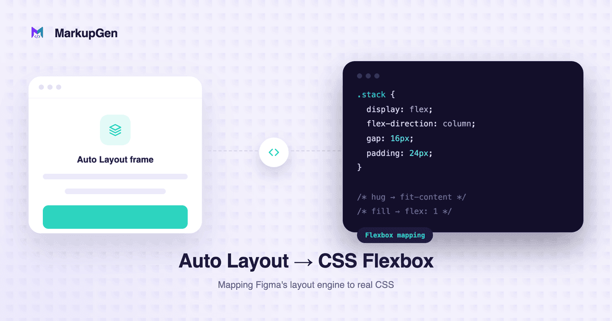
If you've ever opened a Figma file and seen "Auto Layout" turned on for a frame, you've already been looking at something very close to CSS Flexbox — Figma's designers borrowed the mental model on purpose. Direction, gap, padding, and alignment carry across almost one-to-one. Where the Figma-to-CSS mapping gets ambiguous is sizing behavior: "hug," "fill," and "fixed" describe intent, not a single CSS declaration, and the correct output depends on the surrounding layout context. Understanding where the mapping is direct and where it isn't is what lets you go from a design file to maintainable, responsive CSS without guessing at every value by eye.
What Auto Layout Actually Controls
Auto Layout is Figma's way of making a frame behave like a real layout container instead of a group of absolutely positioned shapes. Turn it on for a frame and you get a handful of properties to configure:
- Direction — whether children stack vertically or horizontally.
- Spacing / gap — the fixed distance between each child element.
- Padding — the space between the frame's edge and its children, settable per side.
- Alignment — how children line up along and across the layout axis.
- Resizing behavior — whether the frame and its children hug their content, fill available space, or stay a fixed size.
None of this is arbitrary. Each property exists because it corresponds to something a real layout engine needs to know — which is exactly why it maps so cleanly to CSS Flexbox in most cases.
Figma Auto Layout to Flexbox: Property Mapping
This table is the practical core of the Figma-to-CSS translation. Most rows are a direct swap; a few depend on context, which the Notes column calls out explicitly.
| Figma Auto Layout | CSS equivalent | Notes |
|---|---|---|
| Horizontal direction | flex-direction: row |
Flexbox's default; children lay out left to right. |
| Vertical direction | flex-direction: column |
Children stack top to bottom. |
| Gap | gap |
Direct equivalent — no need for margin-based spacing tricks. |
| Padding | padding |
Applies to the frame that has Auto Layout enabled, not to its children. |
| Alignment (primary axis) | justify-content |
Figma's "primary axis" alignment control. |
| Alignment (counter axis) | align-items, or align-self on one child |
Figma lets a single child override group alignment — that maps to align-self, not a second align-items. |
| Hug contents | often no explicit size, or width/height: fit-content |
Not a universal rule — depends on whether the element is a flex item, a block element, or something else. |
| Fill container | flex: 1, width: 100%, or align-self: stretch, depending on axis |
No single CSS declaration always fills a container; the right one depends on the parent's layout mode. |
| Fixed width/height | explicit width / height, sometimes with min-/max- bounds |
Straightforward, but check whether the design means a hard limit or just a common default size. |
| Spacing mode ("packed" vs. "space between") | gap for packed; justify-content: space-between for space-between |
These are usually mutually exclusive in Figma — space-between distributes space instead of using a fixed gap. |
| Nested Auto Layout | nested elements, each with its own display: flex |
Each nested frame is an independent flex formatting context — translate the structure, not just the values. |
The important caveat: Figma "Fill container" does not always translate to one universal CSS declaration. Whether it should become flex: 1, width: 100%, or align-self: stretch depends on whether the element sits inside a flex container, a block container, or a grid — the same Figma property can require different CSS depending on its parent.
The Mental Model: Auto Layout Container → Flex Container
Once you strip away the Figma UI, the concepts line up directly:
| Figma | CSS |
|---|---|
| Frame with Auto Layout | Container with display: flex |
| Direction | flex-direction |
| Alignment | align-items / justify-content |
| Gap | gap |
| Padding | padding |
| Sizing behavior (hug / fill / fixed) | width / height / flex properties |
Every Auto Layout frame is a flex container in waiting. The work is deciding, for each frame, what its sizing behavior actually means in the surrounding CSS — which is covered next.
Hug Contents, Fill Container, and Fixed Sizing
Sizing behavior is where most hand-translated Figma-to-CSS work goes wrong, because Figma expresses intent while CSS requires a specific declaration.
Hug contents
A "hug contents" element sizes itself around its content — it has no fixed dimension and grows or shrinks as its content changes. On the web, the closest equivalent is often simply not setting an explicit width or height at all, since block and flex items already size to their content by default. Where you do need to be explicit, width: fit-content or height: fit-content gets close, but it isn't universally equivalent — inside a flex container, an item without flex-grow already behaves like "hug" without any extra CSS, so adding fit-content on top can be redundant or, in some browsers, subtly different from the default.
/* Figma: Hug contents, horizontal Auto Layout */
.button {
  display: flex;
  width: fit-content; /* often unnecessary — flex items hug by default */
}
Fill container
A "fill container" element expands to use whatever space is available. The correct CSS depends entirely on the parent:
- Inside a flex container, along the main axis:
flex: 1(orflex-grow: 1). - Inside a flex container, along the cross axis:
align-self: stretch. - Inside a block-level parent:
width: 100%.
/* Figma: Fill container, child of a horizontal Auto Layout frame */
.sidebar-content {
  flex: 1;
}
There is no single "fill container → CSS" rule that works everywhere. Get the parent's layout context wrong and flex: 1 on a non-flex-item does nothing.
Fixed
Fixed dimensions in Figma generally map to an explicit width and/or height in CSS. But a literal pixel value copied straight from Figma often isn't the right target — check whether the design intends a hard constraint (width: 240px) or a bound on an otherwise flexible element (min-width / max-width, min-height / max-height). Treating every fixed value as a hard width is a common source of layouts that don't adapt to real content or different viewports.
Auto Layout vs. Constraints
Auto Layout and Constraints solve related but different problems, and conflating them is a common source of translation errors.
- Auto Layout controls how a frame's children are arranged relative to each other — direction, gap, padding, alignment, and sizing behavior. It's the closest analog to
display: flex. - Constraints control how an element behaves when its parent resizes — pinned to left/right/top/bottom/center, or scaled. Constraints are most relevant for elements that aren't inside an Auto Layout frame at all, or for how an Auto Layout frame itself behaves inside a fixed-size parent.
In practice, an element's final CSS often needs information from both: Auto Layout tells you the flex properties for a container and its children, while constraints tell you whether that container should be treated as fixed, or should resize with its own parent. Neither one alone gives you the full responsive picture.
How Auto Layout Supports Responsive CSS
Auto Layout provides real signal for responsive behavior, but it does not automatically become responsive CSS on its own. It's worth being precise about what it actually gives you:
- Auto Layout's sizing behavior (hug / fill / fixed) tells you which elements should grow, shrink, or stay put — that's the foundation of a responsive layout, translated directly into
flex,width: 100%, or a fixed size. - Figma constraints add information about how elements should behave when their container resizes, which matters for anything not governed by Auto Layout.
- Neither one generates breakpoints. If a design's layout genuinely changes shape at certain widths — columns stacking, navigation collapsing — that still requires CSS media queries, because Figma frames typically represent a handful of fixed viewport sizes, not the full range between them.
- Between the sizes a designer actually specified, fluid sizing (percentages,
flex,minmax(),clamp()) often reproduces the intended behavior more faithfully than adding extra breakpoints to fill the gaps.
The goal is to reproduce the layout's intended behavior across viewports, not to copy the pixel dimensions from whichever Figma frame you happened to be looking at.
When CSS Grid Is a Better Fit
Auto Layout is a single-axis model: it's very good at rows and columns, including nested combinations of them. Some designs are genuinely two-dimensional, though, and forcing them into nested Flexbox produces code that's harder to maintain than the design ever was. The right choice depends on the layout — Flexbox fits one-dimensional arrangements (navigation, button groups, a row of cards, vertically or horizontally aligned content), while Grid fits two-dimensional ones. Reach for CSS Grid when you see:
- A layout where items need to align on both rows and columns simultaneously — card grids, dashboards, or image galleries.
- Explicit "this spans two columns" or "this spans two rows" behavior, which Grid handles natively with
grid-column/grid-rowand Flexbox can't express directly. - Designs where the number of columns should respond to available width (
repeat(auto-fit, minmax(...))) rather than to a fixed breakpoint list. - Overlapping or layered regions within a shared grid, which is straightforward with Grid's placement system and awkward with Flexbox.
A good rule of thumb: if a Figma frame's Auto Layout only ever nests in one direction at a time, Flexbox is a faithful translation. If you find yourself building a grid of Auto Layout frames to fake row-and-column alignment, that's usually Figma's UI compensating for not having a native two-dimensional Grid mode — and it's worth generating actual CSS Grid instead.
Common Auto Layout to CSS Pitfalls
Even with a clean mapping, developers reproducing Auto Layout by hand tend to trip on the same handful of details:
- Mixed alignment gets flattened. Figma lets individual children override the group's alignment; it's easy to eyeball this and apply one
align-itemsvalue to everything, losing per-child overrides that needalign-self. - "Hug" vs. "fill" ambiguity. A frame set to hug its contents looks identical to a fixed-width frame at a single viewport size, but behaves completely differently once content or screen size changes.
- Gap gets skipped in favor of margin. Some developers still reach for margin tricks instead of
gap, inherited from older Flexbox advice — unnecessary now thatgaphas solid browser support, and it reintroduces the exact spacing bugsgapwas meant to fix. - Nested Auto Layout frames become nested flex containers without a plan. Each nested frame is its own flex context, and a literal one-to-one translation can produce more wrapper elements than the layout actually needs.
- Padding lands on the wrong element. It's easy to apply a frame's padding to a child instead of the container, which throws off gap-based spacing between siblings.
- Assuming Auto Layout alone makes a layout responsive. As covered above, Auto Layout and constraints inform responsive behavior — they don't replace media queries when a layout's shape genuinely needs to change.
- Nesting Flexbox to fake a two-dimensional grid. If you're stacking Auto Layout frames to align both rows and columns, that's usually a sign CSS Grid is the better target.
Using Auto Layout in a Figma-to-Code Workflow
This mapping is well understood, but applying it correctly to every frame, every gap value, and every nested container in a real design file — while also interpreting layout direction, sizing behavior, and the hierarchy between frames — is tedious. It's exactly the kind of repetitive translation work MarkupGen is built to help with. The workflow is four steps: export the frame from Figma using the companion plugin, which pulls the structure, styles, and images into your workspace; MarkupGen's AI builds HTML and CSS from that structure, mapping Auto Layout's direction, gap, padding, and alignment onto an equivalent Flexbox structure; you refine content, fonts, and layout visually in an in-app editor; then you export the final package. Responsive breakpoints are generated from the design's resizing constraints, and you choose the output format — vanilla HTML/CSS, Tailwind CSS, or React components — depending on your stack. As with any automated conversion, review the sizing behavior on hug/fill/fixed elements and any breakpoints it infers — they're a strong starting point, not a substitute for checking the result against the design. If you'd rather start from a working example than a blank file, try MarkupGen's Figma to HTML converter on your own design, or read the full Figma-to-HTML conversion guide for the end-to-end workflow.
FAQ
How does Figma Auto Layout translate to CSS?
Direction, gap, padding, and alignment map directly to flex-direction, gap, padding, and justify-content/align-items. Sizing behavior — hug, fill, and fixed — maps to CSS too, but the exact declaration depends on the surrounding layout context rather than being a fixed one-to-one swap.
Is Figma Auto Layout the same as CSS Flexbox? They're closely related, not identical. Auto Layout was deliberately modeled on Flexbox's concepts, so most properties carry across directly. The main difference is that Figma expresses sizing as design intent (hug, fill, fixed), while CSS requires you to choose the specific declaration that produces that intent in a given context.
What does "hug contents" mean in CSS?
It means the element sizes itself around its content instead of taking a fixed or stretched size. On the web this is often the default behavior for block and flex items with no explicit width, or can be made explicit with width: fit-content / height: fit-content where needed.
What does "fill container" mean in CSS?
It means the element expands to use the space available in its parent. Depending on context, that's flex: 1 on the main axis of a flex container, align-self: stretch on the cross axis, or width: 100% inside a block-level parent — there's no single declaration that always applies.
Does Figma Auto Layout create responsive CSS automatically? No. Auto Layout's sizing behavior and Figma's constraints provide useful signal for how elements should adapt, but breakpoints for layouts that change shape at different widths still need to be written as CSS media queries.
Should I use CSS Grid or Flexbox for a Figma design? It depends on the layout, not on which is "better." Flexbox fits one-dimensional arrangements — rows, columns, navigation, button groups. Grid fits genuinely two-dimensional layouts, like dashboards or card grids where items need to align on both rows and columns at once.