
Published 2026-08-20 · By MarkupGen Team
How to Evaluate AI-Generated HTML Before You Ship It
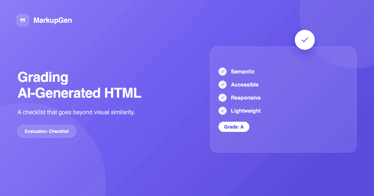
Quick answer: don't judge AI-generated HTML by a single screenshot match. Check visual fidelity across breakpoints, semantic markup (not div soup), real responsive behavior when you resize the browser, basic accessibility (alt text, contrast, keyboard focus), and page weight — an automated visual score is a useful first signal, not a substitute for this.
Why "it looks right" isn't enough
AI Figma-to-code tools vary a lot in what they're actually optimizing for. Some prioritize pixel-perfect visual matching above all else — which can mean the underlying markup is a pile of absolutely positioned <div>s that happens to render identically to the design at one specific width. It looks done. It isn't. A repeatable checklist catches what a glance at the preview won't.
The checklist
1. Visual fidelity at more than one width. Compare the rendered output against the design at the frame's actual size, then resize the browser well past it in both directions. A layout that only matches at exactly 1440px wide isn't responsive — it's a fixed layout that happens to have been checked once.
2. Semantic correctness. Open the actual HTML. Real <header>, <nav>, <main>, <section>, <footer> elements where they fit the content's role, or a page built entirely from generic <div>s? This affects accessibility, SEO and how maintainable the code is for the next person who touches it — see Is Figma-to-HTML Output SEO-Ready? for the fuller checklist on that front.
3. Heading hierarchy. One <h1>, headings that step down in logical order rather than jumping based on font size. This is one of the details AI tools are most likely to get wrong, because it depends on understanding content structure, not just visual layout.
4. Actual responsive behavior, not just breakpoint presence. Resize the browser slowly through the full range rather than checking only mobile and desktop screenshots — content reflow, text wrapping and spacing between those two endpoints is where layouts most often break.
5. Accessibility basics. Alt text on meaningful images (not empty or filename-based), sufficient color contrast on text, and visible focus states on interactive elements. None of this is verifiable from a screenshot comparison alone — it requires opening the markup and, ideally, tabbing through the page. See Figma to Accessible HTML for the full checklist, including buttons vs. links, forms and labels, and when ARIA actually helps.
6. Code weight and cleanliness. Inline styles scattered everywhere, unused CSS carried over from a framework, or excessive wrapper elements all add weight without adding anything visual. Worth a scan even when the page looks correct.
Where an automated score fits — and its actual limit
MarkupGen scores every export automatically by comparing a screenshot of the live preview against the original design on a 1–10 scale, with a breakdown of what matches and what's off. That's a genuinely useful first-pass signal for item 1 above — it catches visual drift fast, and a low score is a clear "look here before you ship" flag. But it's explicitly a visual-match score: it doesn't audit semantics, heading structure, accessibility or code weight, because those aren't things a screenshot comparison can see. Treat it as step one of this checklist, not the whole thing — items 2 through 6 still need a human pass.
If an export's score is fine but something's still visibly off — spacing, a color, alignment — MarkupGen's evaluation view lets you compare the design and live preview side by side, describe the specific fix you want, and regenerate around that feedback rather than starting over. See AI in MarkupGen for how the full scoring and regeneration loop works.
Try it on your own design
Running your own checklist against a real export is the fastest way to see how much of it a given tool already gets right. Try MarkupGen free, or see Figma to Semantic HTML for what semantic-first output looks like specifically.