
Published 2026-08-20 · By MarkupGen Team
Figma to Accessible HTML: A Practical Guide
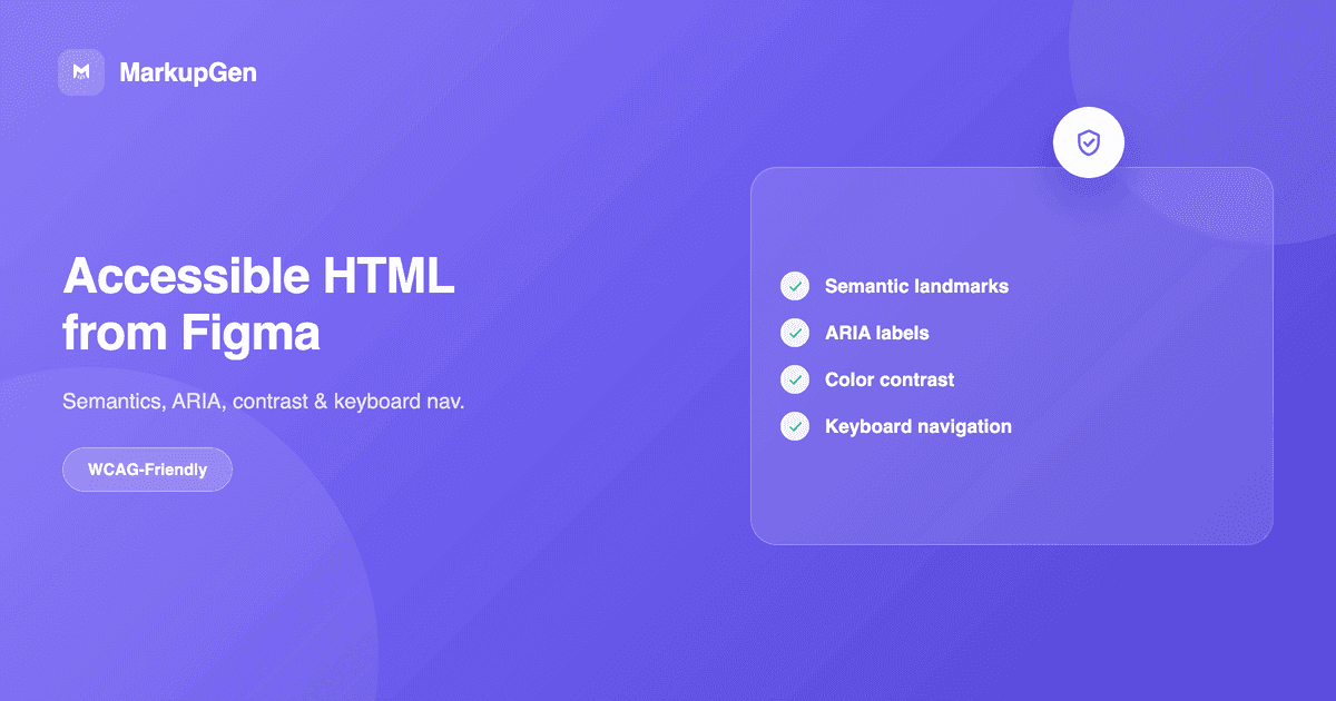
Quick answer: accessibility in a Figma-to-HTML workflow isn't one setting you turn on — it's a handful of specific decisions: real semantic elements instead of styled
<div>s, a heading order that matches content structure (Figma has no native concept of heading levels), labeled form fields and icon-only buttons, visible focus states, sufficient color contrast, and ARIA used sparingly — only where semantic HTML can't express the interaction on its own. Automated output can get you most of the way there; a short manual pass still catches what a design file can't carry.
Why accessibility gets lost in the Figma-to-HTML translation
A Figma file describes what a design looks like. It doesn't describe what a screen reader should announce, which element should receive focus next, or whether a color pair is legible for someone with low vision. That gap is the actual reason accessibility breaks during conversion — not carelessness, but the fact that some of what accessibility needs simply isn't information a design file contains. A pixel-perfect visual match can still be an accessibility failure if the markup underneath it is generic <div>s with no structure, no labels and no keyboard support.
The fix isn't a single automated pass. It's understanding which parts of accessibility a good converter already gets right by generating real structure instead of visual-only markup, and which parts always need a deliberate decision — by a designer, a developer, or both — because the design file genuinely doesn't carry that information.
Figma design decisions that affect accessibility
A few common Figma habits create accessibility problems downstream, before any conversion tool is even involved:
- Color as the only signal. A required form field marked red, or a disabled button that's just a lighter shade of the same color — both invisible to someone who can't distinguish those hues. The distinction needs a second signal (an icon, a label, a pattern), not just a color shift.
- Text baked into images. A headline exported as a flattened PNG might look identical to a real text layer, but it can't be read by a screen reader, resized by the browser, or indexed by a crawler.
- No visual focus state designed. Most Figma component sets have a default, hover and sometimes a disabled state — a focus state (for keyboard users tabbing through the page) is often just never designed, so there's nothing for the conversion to carry over.
- Icon-only buttons with no accessible name anywhere in the file. A trash icon that means "delete" is obvious visually. Nothing in the Figma layer tells a converter — or a screen reader — what the icon means unless the layer itself is named meaningfully.
- Inconsistent heading sizes. Figma has no "Heading 2" element the way a CMS or a word processor does — text layers are just text, styled to look a certain size. Two visually similar headings across different frames can represent completely different levels in the actual content hierarchy.
None of these are conversion bugs. They're decisions that have to be made somewhere in the pipeline, and it's worth knowing that upfront rather than assuming a tool will infer them.
Semantic HTML and landmarks
This is the part of accessibility a good Figma-to-code converter should get right by default: real <header>, <nav>, <main>, <article>, <section>, <aside> and <footer> elements instead of a page built entirely from unlabeled <div>s. Landmarks matter because they're how a screen reader user jumps directly to "main content" or "navigation" instead of tabbing through the entire page linearly. See Figma to Semantic HTML for what MarkupGen's output looks like structurally, and Is Figma-to-HTML Output SEO-Ready? for the overlap between semantic markup and crawlability — the two problems share a root cause and mostly share a fix.
Heading hierarchy
One <h1> per page, and headings that step down in order — an <h3> should be inside a section that already has an <h2>, not jumping there because a text layer happened to look that size in the design. As noted above, Figma doesn't have a native concept of heading levels, so a text layer styled large doesn't automatically become an <h1> — this is worth a manual check regardless of which tool generated the markup, because it depends on understanding the content's actual structure, not just its visual size.
Buttons vs. links
This is one of the most common accessibility mistakes in converted markup, and Figma's component structure doesn't resolve it for you: a <button> is for an action on the current page (submit, open a modal, delete an item); an <a href> is for navigation to a different page or view. A design file full of similarly-styled pill shapes gives no indication which is which — that's a semantic decision, not a visual one, and it directly affects both keyboard behavior (buttons and links respond to different keys by default) and what a screen reader announces.
Forms and labels
Every input needs a real, programmatically associated <label> — not a placeholder standing in for one. Placeholder text disappears the moment a user starts typing, has notoriously poor contrast by default, and isn't reliably read by all screen readers as a substitute for a label. If a form needs to look label-less for design reasons, use a visually-hidden label rather than removing it from the markup entirely. Error messages need to be associated with their field (commonly via aria-describedby), not just placed nearby with color alone signaling the problem.
Images and alt text
Exported images need meaningful alt attributes, not empty strings or a filename. This is one area where a manual pass is genuinely unavoidable: what a decorative background image is for, versus what a product photo needs described, isn't always obvious from the Figma frame alone — the design file doesn't carry the intent, only the pixels. Purely decorative images should get an empty alt="" (so screen readers skip them), while meaningful images need a real description of what they convey, not just what they show.
Keyboard navigation
Every interactive element — links, buttons, form fields — needs to be reachable and operable using only a keyboard, in an order that matches the visual reading order. This is where Auto Layout genuinely helps: because Auto Layout structure carries through into a logical DOM order rather than absolutely positioned fragments, tab order tends to follow reading order automatically instead of jumping around unpredictably the way it can with free-form, absolutely-positioned layouts.
Focus states
Since Figma component sets rarely include a designed focus state, this is usually the single most common accessibility gap in a converted page: a keyboard user tabs through the interface and can't visually tell where they are. At minimum, don't remove the browser's default focus outline (outline: none) without replacing it with something equally visible — a common, easy-to-ship mistake made in the name of matching a design that never accounted for it.
Color contrast
Figma lets you pick any two colors regardless of whether they're legible together, so this needs an explicit check rather than an assumption. WCAG AA asks for at least 4.5:1 contrast for normal body text and 3:1 for large text (18px+ bold, or 24px+ regular) and for meaningful UI components like icons and input borders. Run the design's actual color pairs through a contrast checker before conversion — it's far cheaper to fix a token in Figma than to chase it down across generated markup afterward.
ARIA — when it helps, and when it actively hurts
The first rule of ARIA is still the right one: no ARIA is better than bad ARIA. A native <button> already has the correct role, is focusable, and responds to Enter and Space by default — adding role="button" to it does nothing useful and risks conflicting with the element's real semantics. ARIA earns its place specifically where semantic HTML can't express the interaction on its own:
- Use it:
aria-labelon an icon-only button with no visible text (a trash icon meaning "delete"),aria-expandedon a toggle controlling a collapsible section,aria-live="polite"on a region that updates without a page reload (a form validation message, a cart count). - Don't use it: adding ARIA roles to elements that already have correct native semantics, decorative ARIA that duplicates what's already visible and announced, or
aria-live="assertive"on anything that isn't genuinely urgent — it interrupts screen reader output and is easy to overuse.
Responsive accessibility
Accessibility problems don't stay fixed across breakpoints just because they were addressed at one size. Touch targets need to stay at least roughly 44×44px on mobile even as layouts compress — a button that's comfortably clickable on desktop can become too small to tap reliably once Auto Layout resizing constraints shrink it down. Text needs to reflow rather than get clipped or overlap at narrow widths, and content order shouldn't change confusingly between breakpoints in a way that breaks the logical reading order a screen reader depends on.
Common Figma-to-HTML accessibility mistakes
- Every clickable element converted to a
<div onclick>instead of a real<button>or<a>. - Icon-only buttons with no
aria-label, because the Figma layer was just named "Icon 4." - Color as the only way a state (error, disabled, selected) is communicated.
outline: noneon focus states with nothing visible put in its place.- Placeholder text used as the only label on a form field.
- Decorative images given a filename as
alttext instead of an emptyalt="". - Heading levels chosen by font size in the design instead of actual content structure.
Before / after: an icon-only button
Before — visually correct, not accessible:
<div class="icon-btn" onclick="deleteItem()">
  <svg><!-- trash icon --></svg>
</div>
After — same visual result, actually usable:
<button type="button" class="icon-btn" aria-label="Delete item" onclick="deleteItem()">
  <svg aria-hidden="true"><!-- trash icon --></svg>
</button>
The difference isn't visual at all — it's a real <button> element (focusable, keyboard-operable, announced correctly by a screen reader), an aria-label giving the icon an accessible name, and aria-hidden="true" on the decorative SVG so it isn't announced twice.
Practical accessibility checklist
- One
<h1>per page; headings step down in order, not by font size - Real landmark elements (
header,nav,main,footer) present - Every clickable action is a
<button>; every navigation link is an<a href> - Every form input has a real, associated
<label>— not just a placeholder - Meaningful images have descriptive
alttext; decorative images havealt="" - Focus states are visible on every interactive element
- Tab order matches visual reading order
- Text and UI component contrast meets WCAG AA (4.5:1 / 3:1)
- Color is never the only signal for state or meaning
- ARIA is used only where semantic HTML can't express the interaction
- Touch targets stay usable at mobile breakpoints
- Layout reflows without clipping or overlapping text at narrow widths
How generated code should be reviewed before production
MarkupGen's output favors semantic elements and a real heading structure by default rather than as an opt-in setting, and Auto Layout's structure carrying through into a logical DOM order is most of what makes correct tab order possible in the first place. The automatic AI quality score every export gets is a genuinely useful first signal — but it's explicitly a visual-match score, comparing the rendered preview against the original design. It doesn't audit ARIA correctness, contrast ratios or keyboard behavior, because none of that is visible in a screenshot comparison. Treat the checklist above as the manual pass that comes after a high visual score, not instead of it — see How to Evaluate AI-Generated HTML Before You Ship It for the same principle applied to code review more broadly.
Try it on your own design
The fastest way to see where a design needs an accessibility pass is to convert it and open the actual markup. Try MarkupGen free, or start with the full Figma-to-HTML conversion guide for the end-to-end workflow this guide builds on.