
Published 2026-08-20 · By MarkupGen Team
Figma Auto Layout to React: From Frames to Components
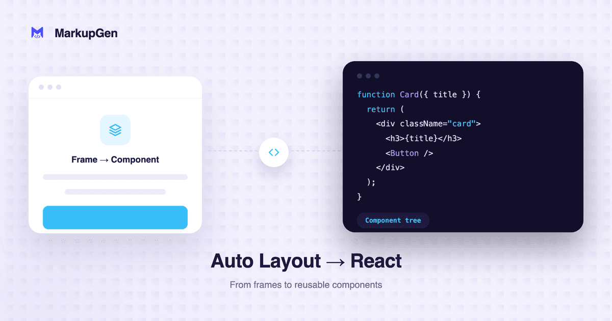
Quick answer: Figma Auto Layout properties (direction, gap, padding, alignment) map to the same Flexbox CSS in React as anywhere else. What's different is everything React adds on top: deciding which Auto Layout frames become their own components, mapping Figma component variants to props, and handling children that repeat or change conditionally.
The CSS mapping doesn't change — the component boundaries do
If you already know how Auto Layout maps to Flexbox, the styling half of this is familiar: direction becomes flex-direction, gap becomes gap, padding becomes padding, alignment becomes justify-content/align-items. React doesn't change any of that.
What React adds is structure above the CSS layer — decisions a flat HTML/CSS export doesn't have to make:
| Figma concept | React equivalent |
|---|---|
| A reusable Auto Layout frame used in multiple places | Its own component, not repeated markup |
| Figma component variants (e.g. button size/state) | Component props (size, variant, disabled) |
| A frame with repeated child instances (list, grid) | .map() over an array of props/content |
| "Hug contents" vs "fill container" resizing | Layout handled by the parent's flex rules, not fixed pixel widths in the component |
| Nested Auto Layout frames | Nested components only where reuse or logical separation justifies it — not one component per frame |
Where hand-translation typically goes wrong
- Over-componentizing. Turning every nested Auto Layout frame into its own component file produces a deep tree of one-line wrapper components that adds indirection without adding reuse. A frame only earns its own component if it's reused elsewhere or if isolating it makes the code meaningfully easier to read.
- Losing variant mapping. Figma component variants (a button's default/hover/disabled states, for example) are meant to become props, not four separate hardcoded components. Skipping this turns a single reusable button into copy-pasted markup for every state.
- Hardcoding what should be dynamic. A frame that repeats three times in the design because there were three sample items shouldn't become three copies of the same JSX — it should become one component rendered from an array.
- Fixed pixel widths where the design intended fluid resizing. Auto Layout's "fill container" behavior should translate to flex-grow/percentage-based sizing in the component's CSS, not a fixed
widththat breaks the responsive intent of the original frame.
How MarkupGen handles this
MarkupGen's React output follows the same four-step workflow as its other formats: export the frame with the plugin, which captures structure, styles, images and component relationships together; AI builds the code from that real structure; refine content, fonts or layout in the in-app editor if needed; export the final package. Auto Layout's direction, gap, padding and alignment map onto Flexbox rules within each component the same way they would in a plain CSS export, and resizing constraints carry through as responsive behavior instead of fixed dimensions. Every export gets an automatic AI quality score comparing the live preview against the original design, so you can tell at a glance whether a given export needs a second look before it ships.
For the full step-by-step on getting from a Figma file to working React components — including output format selection — see Figma to React: A Practical Workflow.
Try it on your own design
Seeing how a real design's Auto Layout structure turns into React components is the fastest way to judge whether the componentization matches how you'd have built it by hand. Try MarkupGen free on your own Figma file, or see the Figma to React converter page for what's included.