
Published 2026-08-20 · By MarkupGen Team
Figma Breakpoints to CSS Media Queries: How the Mapping Works
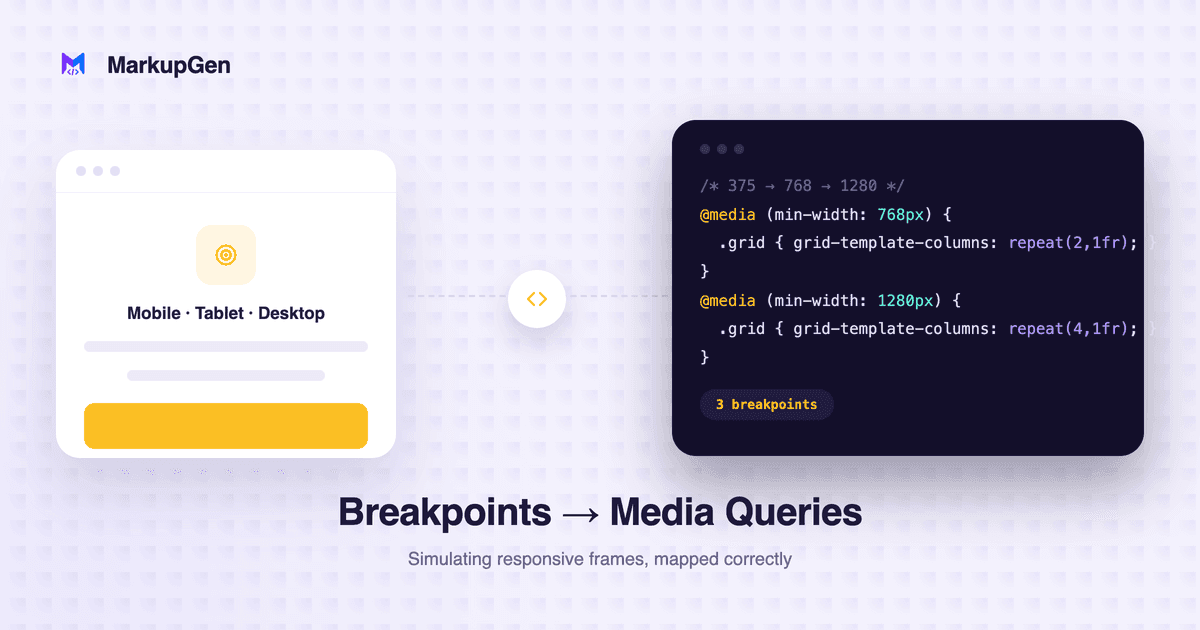
Quick answer: Figma doesn't have a built-in concept of breakpoints the way CSS does. Designers simulate responsiveness with separate frames per screen size, or with Auto Layout's fluid resizing (fill/hug) that needs no media query at all. Which approach the design used determines whether the CSS output needs explicit
@mediarules or not.
Figma doesn't actually have breakpoints
It's worth stating plainly, because it's a common assumption: Figma has no native "set a breakpoint here" feature comparable to a CSS media query. What designers actually do instead falls into two patterns, and they convert to CSS very differently.
Pattern 1: separate frames per screen size
The traditional approach is a distinct frame for desktop, tablet and mobile — each laid out by hand at its own width. This maps directly to explicit CSS breakpoints: each frame's layout becomes the styles inside a corresponding @media (min-width: ...) block, and the developer's job is deciding where the actual breakpoint values should sit (matching the frame widths, or standard breakpoints like 768px/1024px) since Figma frame widths are round design decisions, not CSS specification.
This is the right approach to reach for when the layouts are structurally different between sizes — not just reflowed, but genuinely different (a sidebar that becomes a bottom nav, a 3-column grid that becomes a single column with reordered content).
Pattern 2: fluid Auto Layout resizing — often no media query needed
The other pattern relies on Auto Layout's resizing behavior — "fill container" and "hug contents" — set on a single frame rather than redrawing the whole layout at each width. A row of cards set to wrap and fill available space, a sidebar set to a fixed width next to a "fill" main content area, text that reflows naturally inside a flexible container — none of this needs a breakpoint. It's the same CSS behavior flex-wrap, percentage widths and min-width/max-width give you without a single @media rule.
This is worth calling out because it's the more valuable insight for reviewing generated CSS: not every responsive detail should become a media query. A design that relies on Auto Layout's fluid resizing converts to CSS that's naturally fluid across a range of widths — adding explicit breakpoints on top of that is usually unnecessary work replicating behavior the layout already has.
Where hand-translation usually goes wrong
- Adding breakpoints where fluid CSS already covers it, resulting in more
@mediarules than the design actually needs and a stylesheet that's harder to maintain than the layout justifies. - Missing a real breakpoint when a design does have a structurally different mobile frame, and trying to force the desktop layout to reflow into something it was never designed to become.
- Picking arbitrary breakpoint pixel values that don't match either the design's own frame widths or the project's existing breakpoint scale, creating a one-off value nobody else's CSS uses.
How MarkupGen handles this
Responsive behavior is generated from the frame's actual resizing constraints rather than added as a separate manual pass — Auto Layout's fill/hug settings translate into fluid CSS automatically, the same distinction covered above. For designs where a genuinely different mobile layout exists (or needs to be generated from a single desktop frame), MarkupGen can produce a separate AI-generated mobile or desktop layout — see Figma Responsive Design: Mobile & Desktop Layouts Explained for how that works. For the Auto Layout-to-Flexbox mapping that underlies all of this, see Auto Layout to CSS.
Try it on your own design
The fastest way to see which pattern your own design actually needs is to run it through and check the generated CSS for @media rules — or their absence. Try MarkupGen free on your own Figma file, or see the Figma to HTML converter page for what's included.